
One of the controversial elements of the Orient brand is, undoubtedly, the logo. Some people seem to like it, some are just “okay” with it – and then there are those who simply cannot get over how much it annoys them…

People who like this logo refer to it as classic and royal (though, in fact Royal Orient does not use it) while those who hate the logo say it looks old and outdated, and often say it looks like the Philip Morris logo. Truth be told there are many similarities between the two, but then both just borrow from the styling of old coat-of-arms symbols.
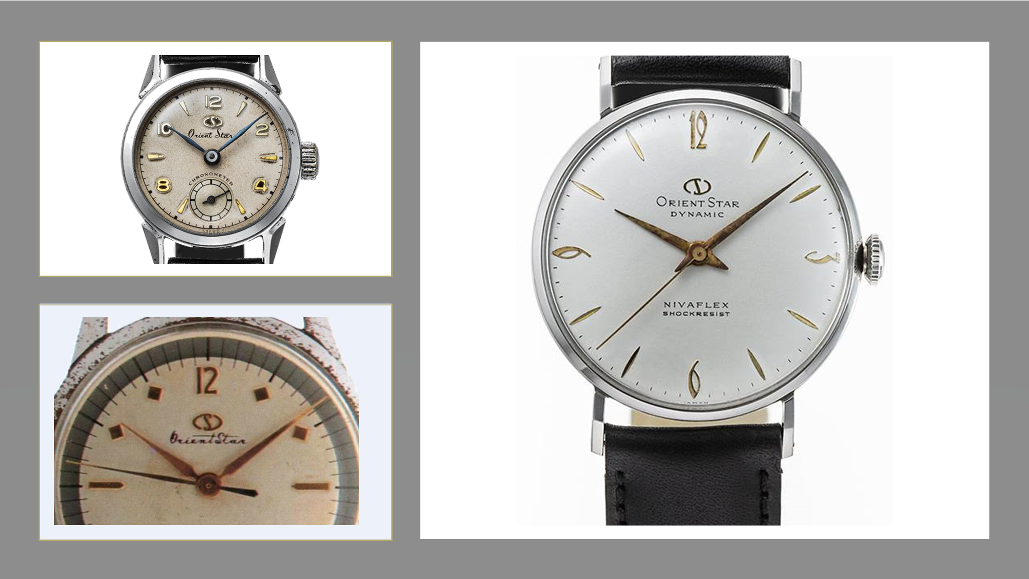
Orient did not actually use this logo in its early years,
and I am not 100% certain when it was designed. The brand’s first watches,
introduced in the 1950s and early 60s, usually simply had the “Orient” name
printed on, in various fonts and styles.
Often, there was no clear branding as such, and the Orient name was simply used as part of the model name (e.g. “Weekly Auto Orient”)

It was the Orient Star sub-brand that received a dedicated logo first, as early as its launch in 1951. The “S” symbol that decorated this more upscale line of watches was refined, and while it underwent some changes over the years it remains largely recognizable throughout its evolution – till this very day.

The familiar logo began appearing on Orient watches around the mid 1960s, although logo-less models continued to show up long after. During the 80s, for instance, most quartz Orients did not have the logo on them. More recently however the logo became an inseparable part of the brand’s dial design.

Interestingly, Orient provided a rational explanation to the design: In a letter published a few years ago by Jun Watanabe, president of Orient Watch Company, he stated that the lion on the left symbolizes the company, while the second lion symbolizes their dealers and partners. The crown above the shield symbolizes the customer. The entire emblem therefore represents Orient’s respect for its customers and the desire to provide them with quality products.
Last but not least, comes Royal Orient. This line of higher-end watches was introduced in 1958, and at first – did not bear any unique logo. In its modern iteration, it briefly adopted the crown logo, then – the “R” logo, similar to the classic Orient Star symbol. Finally, in its latest production runs prior to being discontinued, it returned to a clean text-only logo.

Back to the main argument though… where do you stand on the question of the Orient logo? Like it? Hate it? Share your thoughts with us!
Photos taken in part from Orient Place blog own photography, and in part – from official Orient catalogs and old sale ads.
UPDATE:
After this article was published, an avid reader (thank you, omegaforest!) pointed out an additional, rare variation of the logo that seemed to be used with only a few old models - apparently "AAA" models from the later 1960s. This version used only the stylized "O", which appears on the shield in the full logo.

The Royal Orient is my favorite. Thanks for the article.
ReplyDeletethank you for following and reading!
Deletehttp://antiquewatchat.blogspot.com/2020/12/calendar-orient-aaa-swimmer-21-jewels.html
ReplyDeleteTake a look at this Orient logo. Was told it was pretty rare.
Thank you for pointing this one out! Very rare indeed. Looks like it's been used with a few "AAA" models. I think I might just add a few words on this variant in the article.
DeleteI like the two lion logo. It adds a pop of color without being over the top distracting.
ReplyDeleteDo you have any books on the history of Orient watches that you would recommend to fellow enthusiasts?
Hi! Unfortunately, the few books I've come across that discuss Orient's history were all in Japanese. They could be nice as collectors items, but to get information I find that online sources are more practical.
DeleteA few, if not all, of the early 70s Chronoaces had a clean ’Orient' text only logo.
ReplyDeleteTrue, text-only dials were quite common. My Chronoace does actually have the logo, but I have other 70s models without it, such as the GM.
DeleteI really like the lions and the big O. It is something different in a sea of sameness for many watch dials
ReplyDeleteIt definitely is different from most watch brands - I can think of a few who have stylized, coat-of-arms like logos, such as Festina and Frederique Constant, however they don't usually place it on their dials.
DeleteGreg here from Greece.
ReplyDeleteThe logo with the lions and the big O at the center, is the first watch symbol I can remember, from my dad's 3 star Orient, from 1976. So, for me this symbol is perfect!!!
Love the logo and the brand.
ReplyDeleteI also thought the Orient logo-less watches were exclusive to some older Quartz models. However, I have come across some older (80's,90's) Automatic models that were logo-less. Anyone know the explanation for that? Thanks.
ReplyDelete